
3015 Tennis Academy
Making the Booking Experience Easier
From the First Click.
Project Overview
3015 Tennis Academy needed a smoother booking experience for families, players, and parents registering for lessons and programs. The existing flow required users to move through long forms with multiple sections visible at once, creating unnecessary scrolling and making the process feel heavier than it needed to be.
We redesigned the experience around progressive steps, clearer information hierarchy, and a more focused flow that shows users only what they need at each stage. The goal was simple: make registration feel easier, faster, and more intuitive without removing the information the academy still needs.
The Challenge
Too Much Information Was Competing for Attention at Once.
The booking experience contained several long form sections, including child information and parent information.
Although the required information was important, displaying too much of it at the same time made the flow feel longer and more complicated.
The challenge was not to remove important fields. It was to present them at the right moment.
The main UX challenges were excessive scrolling, repeated information, unclear progression, and too much visual competition between form sections.
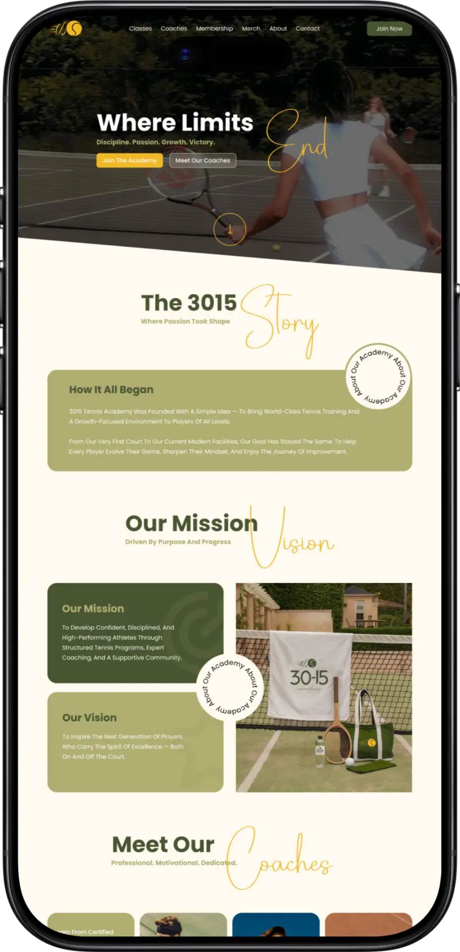
Our Solution
We Turned a Long Form Into a Clear Step-by-Step Experience.
Our approach included:
The Results
The redesigned booking flow creates a more focused path through registration while keeping all necessary information within the experience.
Users can complete each stage with less visual distraction and move naturally from one section to the next.

Let’s Build Something Good.
From complex forms to complete digital experiences, we design clearer user journeys that make the next step easier.
Start Your Project